Solving Onboarding Difficulties for Decentralized Blockchain Applications
Product and Visual Design
Product and Visual Design

Blocknative develops web software to help decentralized application (Dapp) developers and wallet providers in the blockchain environment improve their application’s user experience (UX).
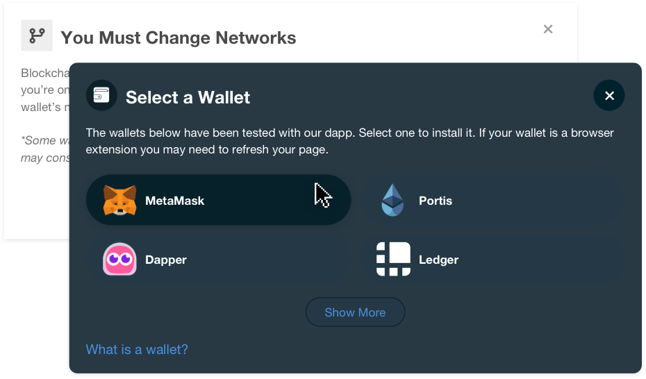
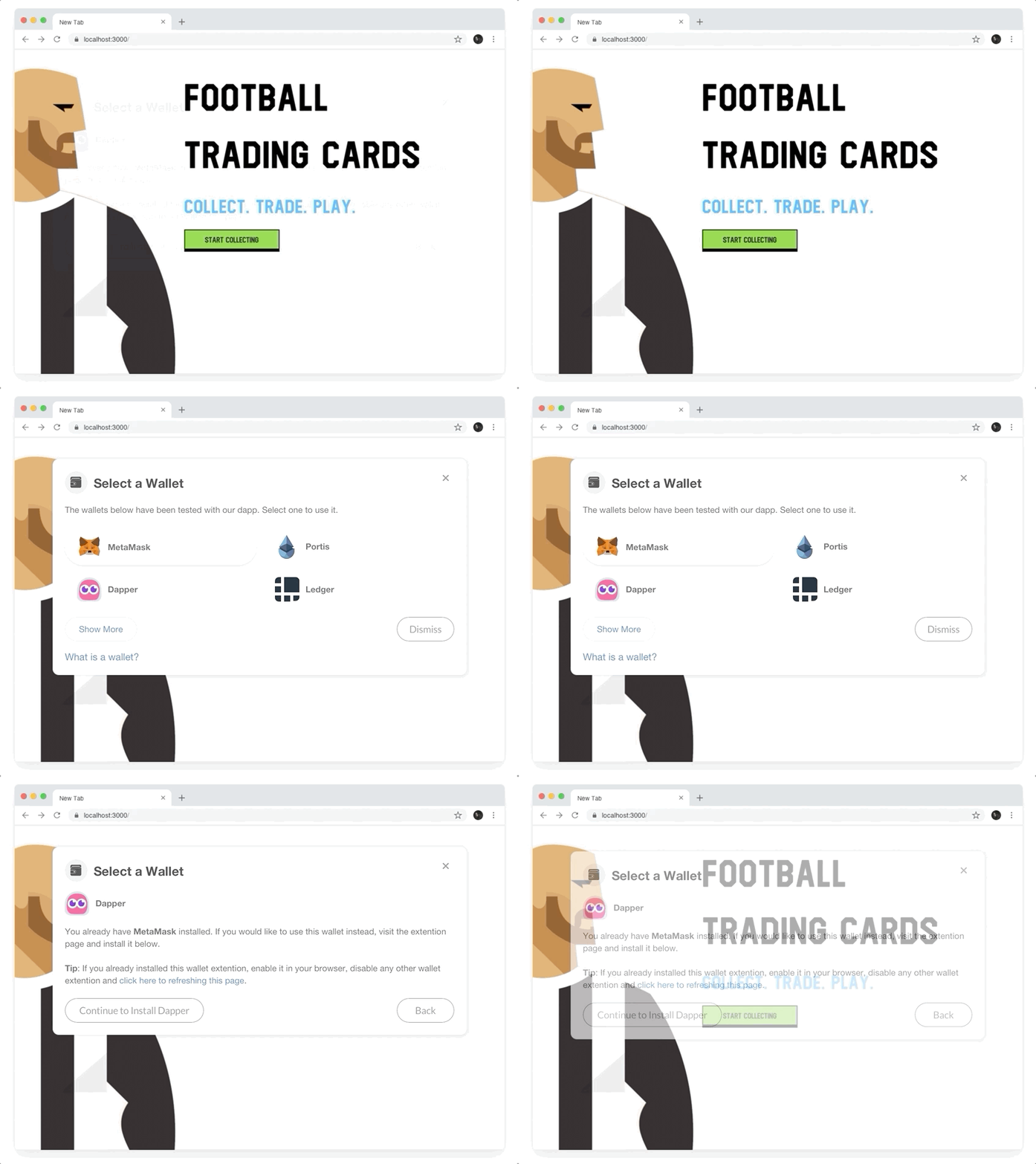
We explored visual and UX updates to Blocknative’s “Assist” product designed to help new and experienced users select a wallet to use with the Dapp and onboard them effectively.
The goal was to move the design from supporting one primary wallet to any number of wallets while reducing complexity. This would let any developer install it in their Dapp, giving them full control and giving end users more options and a streamlined experience.
In the blockchain space, there are new types of applications called Dapps that create and process transactions on the Ethereum (ETH) blockchain. In order to use the Dapp and make transactions, a user must install what is called a “wallet” which can receive and send ETH, a type of cryptocurrency.
There are many wallets a user can choose to install to interact with a Dapp, but many Dapps only support a handfull of specific wallets. Adding to the complexity, a wallet can either be a browser extension, coded into the Dapp, or even an external piece of hardware that can be plugged into a computer and detected by the Dapp.
We identified this issue over a year ago, and our solution at the time was to build an onboarding experience specific to the most popular wallet provider, MetaMask. After a year of feedback from users and observing changes in the environment, a significant update was needed.
Over the course of a yea, the team at Blocknative connected with Dapp developers, both in person and online in a Discord community we created. While some developers have experience building web-based applications, many are junior developers or have trouble navigating the UX complexities of decentralized application onboarding, because it’s such a new, complex and fast-changing environment.
UX is a known problem with Dapps today; average users of Dapps tend to run into a lot of challenging roadblocks, simply because of overly-complex solutions. My aim with the project was to meet our goals while getting out of the user's way.
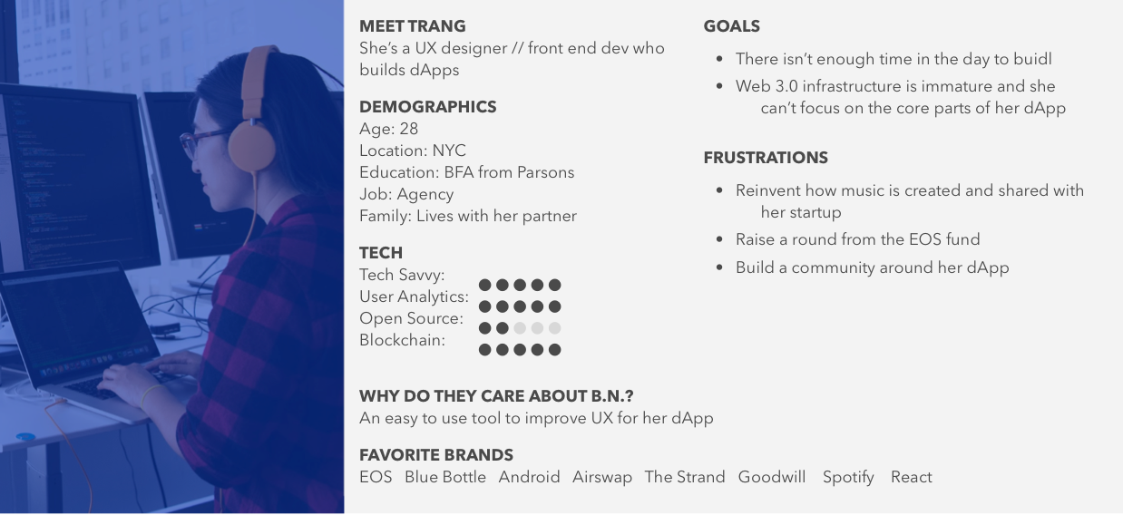
I worked remotely with our CEO, CTO, and developers in the US and Australia to bring the project together and understand needs and requirements.
As the lead designer, I was tasked to review the current available solutions, investigate client feedback and make recommendations for changes to the user journey, while improving the product's design aesthetic.
We had specific time restraints as well as investment decisions to consider in order to meet the company's fundraising goals as soon as possible. While this may have hampered some additional research, our team was quite experienced and well-embedded in the Ethereum development space to know what was needed.
Over the course of 2 weeks, I reviewed currently-available solutions, many of which were built by specific Dapp teams, that tackled a small portion of the problem specific to their own needs.
I first outlined the requested updates, as well as obvious upgrades that were needed from leadership. I reviewed all of the client feedback and collaborated with our lead developer on technical options. That was then synthesized into a specification document to capture every detail which helped me build a flow of the user journey, as well as update mockups of the visual design.
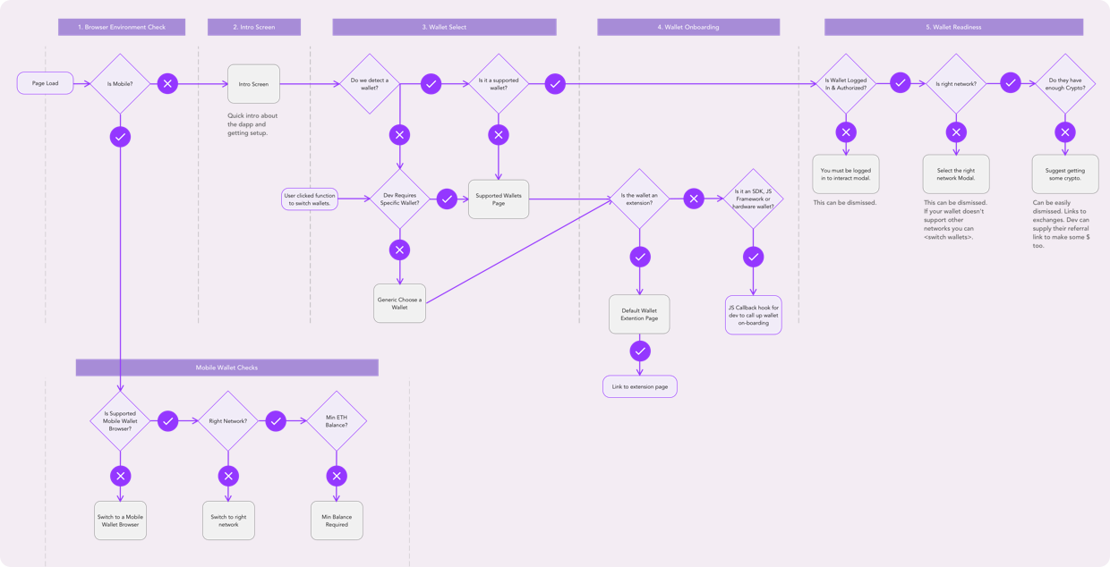
We then got into a pattern of iteration and collaboration over the final details with the lead developer and team leadership, preparing the final spec document for design handoff.
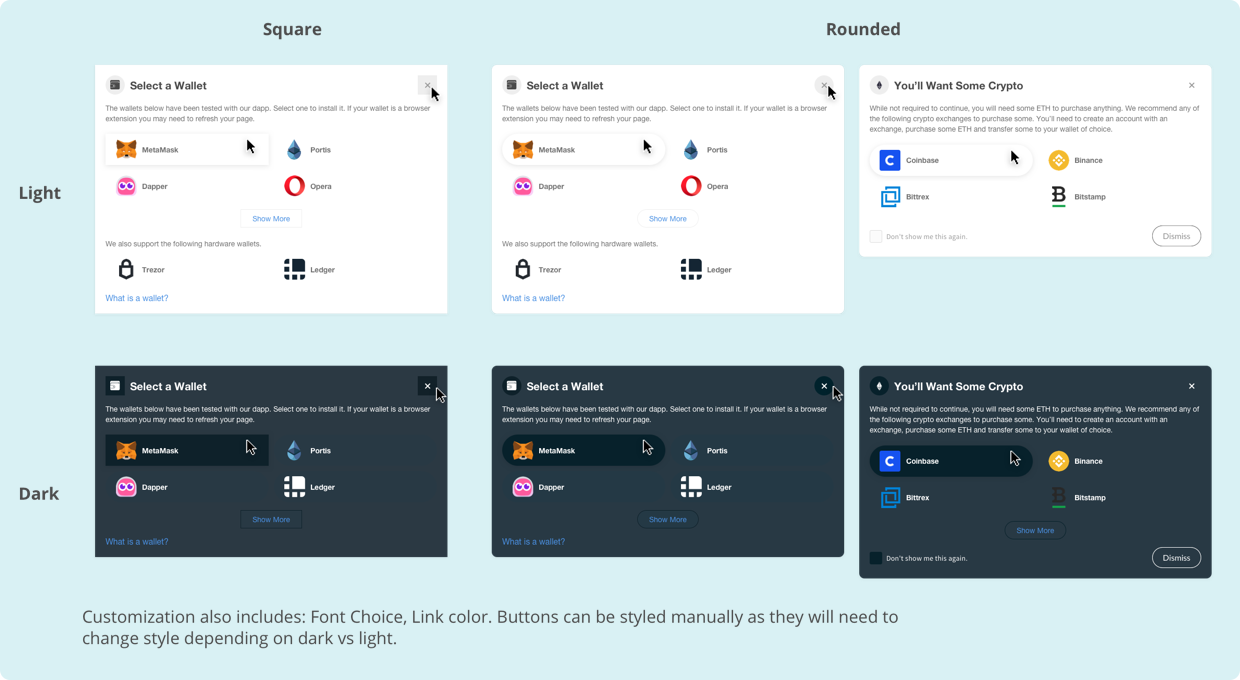
Finally, after the development team had a working prototype, I tested and reviewed it in order to make final adjustments and ensure quality in the implementation.
The resulting product focused on outputting very specific solutions. It gave full control to the developer to pick from two different styles, or to simply add their own custom CSS to match their Dapp. It also guided users towards finding the right wallet for them while giving the developer plenty of options for which wallets to support.
It assisted in user success, notifying them to login and authorize their wallet, change networks if their wallet was wrong, and provide guidance on where to get crypto if they didn’t have any. All improvements were designed to support the user, but they could be easily dismissed if not needed.
Overall, the product updates were successful, and the results were well-received. We saw an uptick in interest as we started beta testing and as a result it's help drive sales efforts forward.
During this project, I learned the need for documenting design specs in high detail when going for a refined visual design.
This project marked a milestone for Blocknative in building what we believe to be the best possible option available for Dapp onboarding today. I was excited to see how fast the team produced something so cutting-edge, driven by clear requirements and great talent.
Thanks for reading! If you want to collaborate, talk about product design, or just want to say hello, hit me up at matth@anothercolor.com or connect via LinkedIn.
I am available for HIRE. :)