Usability Research of State Benefit Programs for Low-Income Residents
Product and Visual Design

Product and Visual Design
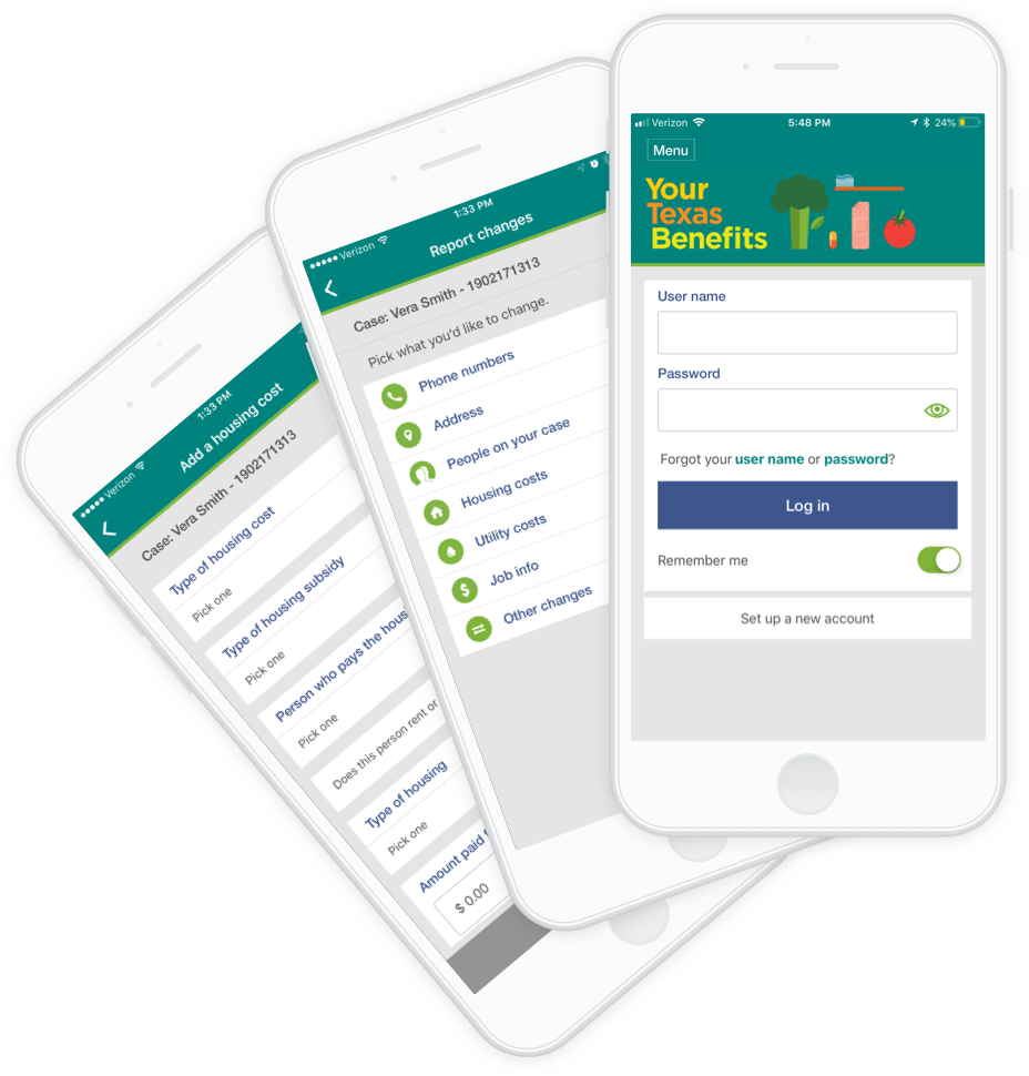
YourTexasBenefits is an app used by people who are seeking to apply for and manage a variety of public benefits in the state of Texas. I worked on this project over the course of a year as a UX designer employed with Deloitte Digital, one of the largest digital agencies in the US.
My objective while working on this project was to continually research and find ways to improve the experience of applying for, updating and managing benefits for people in need. This would allow people using this service to do so without making long trips to benefit offices, waiting hours to be seen, spending time on the phone with support agents, all while keeping them up-to-date on the status of their benefits.
The state of Texas is constantly striving to make benefit management easier and more accessible. Due to life circumstances, some people need help receiving benefits such as Medicaid, Snap & WIC food benefits, health care, and other support services.
In order to apply for and manage these benefits, a person must visit a physical benefits office. Once their application is submitted, they need to be able to receive and reply to requests for additional paperwork. Paperwork changes would often result in changes to their benefits, and would again require back-and-forth communication via US mail.
Pain point 1: Person needs to visit a benefits center to apply for benefits or update benefits information.
Pain point 2: Person is unable to know, clearly, what their benefits are at any given time without a phone call or an office visit.
Pain point 3: Person has to submit changes in documents in person or by mail, and response times to changes are not prompt.
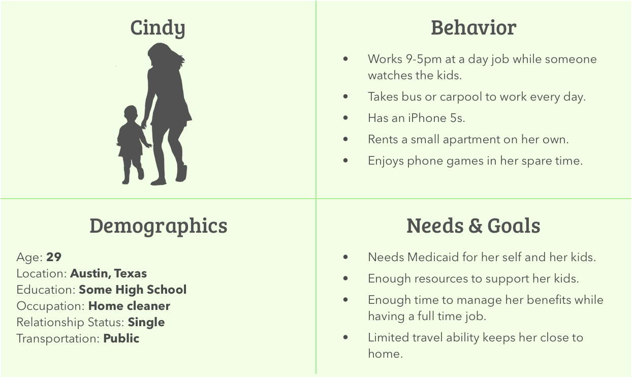
Users of the app are residents of Texas who are dealing with unfortunate circumstances in their lives. Often, the average reading level was a high school level. Nearly half of users were Spanish-speaking requiring us to employee copy writers who could also write in Spanish.
The most challenging aspect was that many people had little experience with cell phone apps, if they had a cell phone at all. They also had limited access to computers and email. This meant that concepts for the app had to be simple and easy to navigate.
We often went on research trips to benefit offices; we’d meet with desk attendants and users in person to collect anonymous data about the struggles people encountered while using the app.
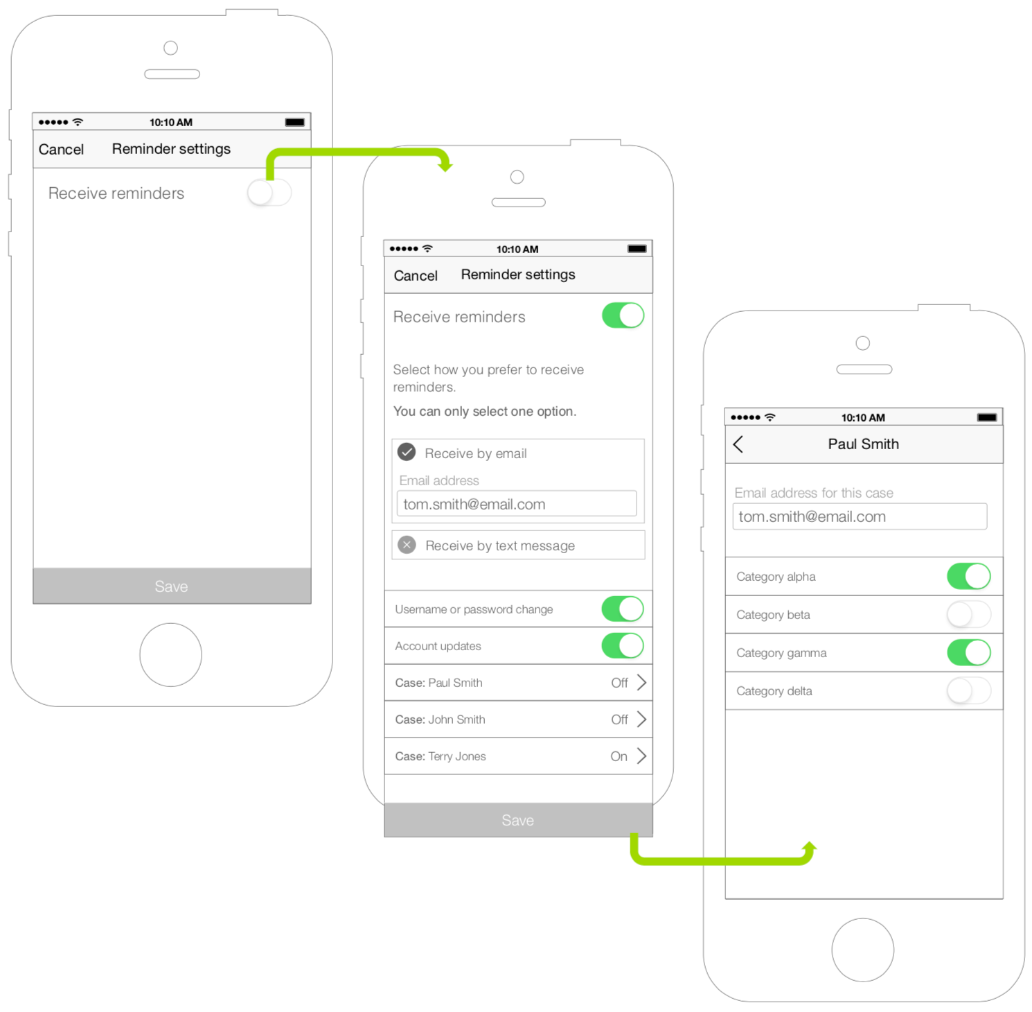
Many people relied on the app to apply for benefits as well as update details about employment or living situations.They could also self-upload and submit files needed to process their claims.
I worked remotely with a team of three which included a project manager, documentation and copy writer, and one other UX designer. We would routinely meet online to discuss priorities and organize our efforts using Jira. Twice a month, we’d fly to Texas to meet with stakeholders and perform user testing.
I helped drive the UX process through wireflow mockups and documentation of feature changes while also identifying room for improvements. I led our on-site research trips and engaged with users directly, as well.
Government programs require extensive testing, research and documentation in order to make any changes. Any proposed change required legal and administrative review and sign off before testing and development.
We were also constrained by testing due to confidentiality concerns and how we would handle engaging with the population. All questions and tests needed to be approved beforehand.
While our process of doing UX updates was similar to that of an agile approach, we often had to function in a waterfall development model as much of what we designed was built and shipped by a different team.
The typical process of identifying, designing and managing an update proceeded as follows.
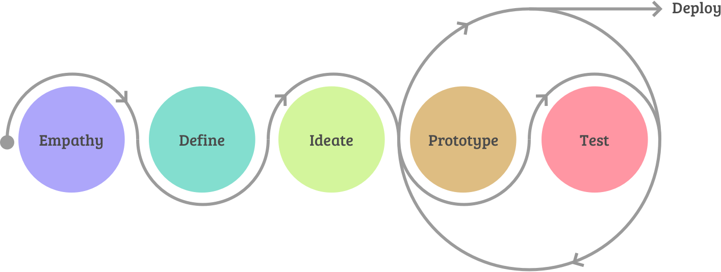
We used this process to make sure decisions were well thought out, supported by testing and research, and approved by stakeholders.
We could expect the occasional need to go through extensive government approvals for minor changes as well as the need to meet heavy mobile accessibility guidelines for every feature.
After going through these processes again and again, I learned a lot about how to fully document an intricate process of application updates across teams. Unfortunately, government requirements restricted us from collecting data to measure impacts, but comments often suggested we were making the right decisions.
I conducted over 150 in-person user tests, on average 12-15 per session. I visited 5 different service phone sites in Texas for content feedback, review and problem discovery.
Matt’s work helped us execute on key UX improvements to the app. He helped manage research on-site and put together key artifacts that helped with stakeholder approval, testing and development.“Laura Pionek, Senior UX Architect - Deloitte Digital
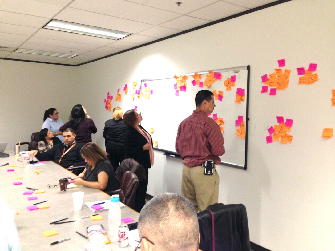
As a result of my work and experience with benefit and insurance programs, I was selected to travel to Washington State and Pennsylvania to direct stakeholder meetings and run feature discovery clinics. These clinics implemented tactics like card sorting and team feedback sessions to discover how we could improve their benefit programs.
The most rewarding aspect of this project was seeing how the changes we made on the app impacted people’s lives in a positive manner. It saved thousands of people's time and travel expenses, especially those who really needed it.
Thanks for reading! If you want to collaborate, talk about product design, or just want to say hello, hit me up at matth@anothercolor.com or connect via LinkedIn.
I am available for HIRE. :)